

Have you ever eagerly downloaded a new app with high hopes, only to struggle to navigate a cluttered and confusing user interface?
You spend countless minutes searching for the needed features, which seem hidden in a maze of menus and buttons. It’s like trying to navigate a complex puzzle that has no solution.
Eventually, you realise that you are getting nowhere, and, feeling frustrated and disappointed, you delete it from your phone.
As a digital product designer, you never want your users to feel frustrated or confused while using your product. But how can you ensure a positive user experience?
The answer is simple: embrace UI (user interface) design when designing an MVP (minimum viable product). UI design can transform a mediocre experience into a seamless and intuitive one.
A well-designed user interface enhances your product’s usability and creates a positive emotional connection with your users, leading to increased engagement, customer loyalty, and business success.
Are you curious about UI design and how it can enhance your product or website? In this article, we’ll take a deep dive into the world of UI design, starting with the basics.
Then, we’ll explore the importance of user research and the six stages of the user interface design process. We’ll also share some UI design best practices from our experienced designers at MOHARA.
Whether you’re a seasoned designer or a founder new to the world of UI design, this article has got you covered. By the end, you’ll have a solid understanding of UI design and the essential principles to create engaging and intuitive user interfaces. So, let’s dive in!
What Is User Interface Design?
User Interface (UI) design refers to designing the graphical interface of software, websites, or applications. The UI designer strives to create intuitive, user-friendly, and visually engaging interfaces.
The UI design process involves various skills and disciplines, including graphic design, information architecture, user research, and usability testing.
UI designers focus on the interface’s layout, styling, and interactivity, paying close attention to factors such as colour, typography, iconography, user flow, and usability testing.
UX Vs. UI: What’s the Difference?
User experience (UX) and user interface (UI) are distinct but interrelated design processes that work in tandem during the product development process.
The UX design process is focused on understanding the customer’s journey. To do this, UX designers get into the customer’s mind to create a product that balances functionality and user experience. To achieve this, UX designers conduct user research, identify pain points, design user flows, and test the product with real users.
On the other hand, UI design focuses on the visual and interactive aspects of the product’s user interface. It involves choosing colours, typography, and other visual design elements to create an aesthetically pleasing and engaging interface that users can easily interact with.
A UI designer works to transform wireframes into polished graphical interfaces that align with the product’s brand and visual identity.
In essence, UX provides the foundation for UI by creating a user-centric design that addresses user needs, and UI builds on this foundation to create a visually appealing and engaging interface. It’s not an either-or situation; UX and UI are two processes essential for creating a successful digital product.
But First, Research!
Creating a product that users love is the ultimate goal of any UI designer. But how can you ensure that your design resonates with your target audience? The answer lies in user research.
User research forms the foundation for creating user-centred designs that cater to your target audience’s specific needs and preferences. It’s the key to unlocking valuable insights that can inform your design decisions and give customers exactly what they want.
Several methodologies and techniques can be employed by UI and UX designers for user research, including:
📊Conducting surveys and supplying user groups with questionnaires
📊One-on-one interviews
📊Explorative usability testing
📊Creating empathy maps
📊Identifying user pain points
📊Creating user personas
📊Competitor analysis
Research plays a vital role in product development and should never be underestimated. Without research, you risk creating a product that doesn’t resonate with your target audience or doesn’t meet their expectations.
Ultimately, investing time and resources in research can help you create a product that is not only visually appealing, but also functional, user-friendly, and meets the needs of your target audience.
| 💡 Expert Insight:
“Research is critical to understanding the user’s needs, goals, and behaviours, which is essential for creating a product that meets those needs. Also, research is often project-specific, and the type of research approach may vary depending on the project’s stage and scope”. Justine Montgomery – Designer at MOHARA |
The Six Stages of the UI Design Process
Once you have a good understanding of your target audience, it’s time to start designing your product. At MOHARA, our UI design process typically involves six key stages: setting up a problem-solving workshop, wireframes, component design, user flows, high-fidelity designs, and creating an MVP/prototype.
In this section, we’ll explore these stages in more detail and discuss their importance in the design process.
Step 1: Set up a problem-solving workshop
At MOHARA, the first step in our design process is to set up a problem-solving workshop.
A problem-solving workshop is a collaborative event or session where founders, designers, and developers come together to identify, analyze, and develop solutions for a new product and decide on the key features that the MVP will contain.
The main goal of this process is to foster creative thinking, encourage teamwork, and facilitate learning by sharing ideas, experiences, and perspectives.
| 💡 Expert Insight:
“For an MVP to succeed, a problem-solving workshop will ideally be the first step. It gives the designer a deep understanding of the founders and the company. And it’s a great chance for everybody to align and bring their ideas to the table as well, and get a lot of inspiration and direction for the project”. Carmyn Von Mollendorf – Designer at MOHARA |
Before building a project, the team needs to lay down some groundwork, which is why a problem-solving workshop is so important! It’s a space where the team can focus on nailing down the key selling point of a product.
When it comes to start-ups, time and budget are huge considerations; the idea is to get a single key feature that will be used to build out a proof of concept or MVP that can be tested in the market.
During this phase, we might even sketch some rough designs on paper. Once we’ve got a good sense of what a founder wants, it’s time to create a wireframe – a more detailed blueprint of the product’s structure and functionality.
Step 2: Sketches and wireframes
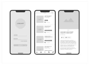
After we’ve brainstormed and sketched some rough ideas on whiteboards and notebooks during the problem-solving workshop, the next step in our UI design process is creating a wireframe.
Think of a wireframe as a simplified blueprint or rough draft of a digital product’s layout and structure. It’s low-fidelity, meaning it’s not overly detailed or polished – just a basic visual representation of what the product will look like.
A wireframe will give stakeholders a tangible idea of the placement and relationship between various user interface elements, such as navigation menus, buttons, images, and text blocks.
| 💡Tool tip: The best tools to create wireframes are Figma, Sketch, Axure, and Balsamiq |
Step 3: Component design
In digital product design, component design comes after the wireframing stage.
After the team has figured out the general structure and functionality of the product using wireframes, they can start designing the specific components that make up the interface. This includes buttons, forms, menus, icons, and other interactive elements that users will see and use to achieve their goals with the product.
By creating a standard set of common UI elements, designers can create a cohesive user experience, streamline the design and development process, and maintain visual and functional consistency.
Components are the building blocks of any design system. They’re crucial to creating a cohesive and effective user experience (don’t worry, we’ll dive into the details of design systems later on!).
Step 4: User flows

The next step in the design process is deciding on the user flow or journey. A user flow is an important aspect of the UX design process. It is a high-level representation of how users interact with the interface design of a digital product and experience their user journey.
User flows help designers understand how their users interact within the system, accomplish tasks, and achieve what they set out to do.
A user flow begins with the entry point to your product, like a home page or a login screen, and ends with the exit point, where the user completes the process by following several steps in the flow.
By mapping out these paths, UI designers can identify potential pain points, bottlenecks, and areas for improvement in the user experience. It’s crucial to get this right, and research makes this process easier:
| 💡Tool tip: The best tools for creating user flows are: Overflow, FlowMapp, Justinmind’s wireframing tool, and Miro |
Step 5: High-fidelity designs
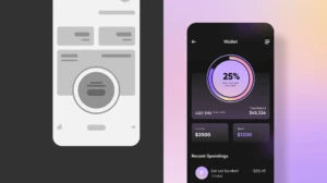
Once you have nailed down a wireframe, components, and a user flow, the next step in the UI design process it to put them all together in a high-fidelity design.
A high-fidelity design, often called a high-fi design, breathes life into a digital product by incorporating graphical components that mirror the final product’s appearance and proposed functionality.
High-fidelity designs are static images incorporating branding and visual elements such as colours, typography, icons, images, and other graphic components that closely resemble the final product. They provide a realistic preview of the user interface to stakeholders.
| 💡Tool tip: The best tools for creating high-fidelity designs are Sketch, Figma, Adobe XD, and Zeplin |
Step 6: Prototype / MVP
Step 6 is where everything comes together! While high-fidelity designs focus on the aesthetics of a product, a prototype is an MVP, the first version of your product. It’s a working model that users can interact with.
Users can navigate through screens, click buttons, and interact with interface elements. They simulate the functionality and user flow of the final product, enabling designers to evaluate and test the overall user experience.
The main purpose of a prototype is to test and validate the functionality, user flow, and overall user experience before moving into development. A prototype assists design teams in testing the product’s usability and getting user feedback, allowing potential issues to be identified and refining the design.
| 💡Tool tip: At MOHARA, Figma is our preferred prototyping tool |
If You Want Great UI, Develop a Design System
As designers progress through the UI design stages – from ideation and wireframing to high-fidelity mockups and prototyping – they create and refine the components that will make up the final product.
A design system provides a centralised location for these components and guidelines, ensuring consistency across the product and any other products within the same ecosystem.
If you want to create an MVP that’s both effective and user-friendly, you need a well-organised design system. Trust us, it’s a game-changer! But don’t stress if you’re not sure how to get started. We’re here to help you out! Keep reading to learn more about creating a design system that will make your MVP shine.
But first, what is a design system?
A design system is a collection of reusable components, guidelines, and principles that help designers and engineers maintain consistency when designing products for a particular organisation.
A design system’s true worth lies in its capacity to provide product teams with the necessary direction to develop digital products with great user experiences. It goes beyond just guiding designers on what and how to create – a good design system also offers the reasoning and inspiration behind design choices.
Since every organisation has unique needs, creating a universal list of elements that should be included in a design system is challenging. However, many design systems share some universal components, which we’ll discuss below.
Best practices for developing a design system
To gain insights into creating effective design systems, we consulted with our team of UI designers at MOHARA. Drawing from their experience, we’ve compiled a list of best practices and essential elements that should be included in a successful design system.
🔶Design principles
Design principles are the overarching ideas that guide the design process and include statements that capture the essence of the design philosophy. This provides clarity and direction to the design team, ensuring that they remain focused on the user’s needs and preferences.
For instance, when Quartz redesigned its website in 2014, their team based its work on design principles such as “Stay out of the users’ way”, “Let the stories shine”, and “Make sure it works on mobile”.
Design principles may be established at the beginning of a project or they may evolve, and are informed by research, user feedback, and UI best practices.
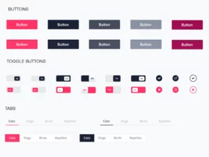
🔶UI kit/library
A UI kit, also known as a user interface (UI) library, contains all the building blocks of the user interface, such as icons, buttons, form fields, menus, typography styles, and colour palettes.
These components are designed to be reusable and can be combined in various ways to create different screens and layouts.
Access to this library speeds up the design and development process. It ensures consistency across the product.
| 💡 Expert Insight:
“By defining styles, colours, and other elements in a centralised location, you can ensure consistency throughout the product and reduce confusion among designers and developers. Also, having limited colours and elements means designers can streamline the design process and make it easier for developers to implement the design. This also makes it easier to scale the product in the long run”. Justine Montgomery – Designer at MOHARA |
🔶Style guides
The design system should include a comprehensive style guide that serves as a reference for anyone working on the brand identity of the company or product.
The purpose of a style guide is to ensure consistency in the brand’s communication and visual identity, regardless of who creates or implements it. By following the guidelines in the style guide, stakeholders can create cohesive and compelling brand experiences that resonate with the target audience.
A typical style guide includes information on:
➡️A brand’s visual identity: These guidelines establish the visual and functional standards for the product or organisation. They cover typography, colour, iconography, layout, and other design elements. A style guide will also include brand assets like logos and images.
➡️Tone of voice guidelines: This section outlines the brand’s voice and tone guidelines for writing content, and may include information on the company’s values and mission statement.
🔶Accessibility guidelines
These guidelines ensure that the product is accessible to users with disabilities to comply with the Web Content Accessibility Guidelines.
This includes using clear and readable typography, high-contrast colours, and alternative text for images and other media.
🔶Documentation is also important in a design system
As your design system evolves, it’s important to document best practices for using and maintaining it effectively. These guidelines should cover how team members can contribute to the design system, how to report issues with the system, and how to keep it updated.
When guidelines and recommendations are clearly documented, they allow teams to work more efficiently and effectively from the beginning. This helps ensure the design system is used consistently, resulting in a better user experience and more cohesive design practices.
Essential Principles for Effective and Intuitive UI Design
✅Be consistent
We can’t stress it enough: consistency is key in UI design! It’s what helps create a memorable and enjoyable user experience, builds trust with users, and establishes your brand recognition.
Plus, it makes it easier for users to navigate your interface without getting confused or frustrated. To achieve consistency in your designs, try using a design system, establishing a clear visual hierarchy, and sticking to a consistent typography and colour scheme.
By doing so, you’ll create interfaces that not only look good, but are also user-friendly and effective. So, remember to keep it consistent, and you’ll have users coming back for more!
✅Feedback, feedback, and more feedback!

Make sure you’re getting feedback from your users regularly throughout the design process. This can involve anything from user testing and surveys to just chatting with users and hearing what they say.
But the most important thing is to be open to that feedback and listen to what users tell you. Take that feedback and use it to make real improvements to the interface.
Don’t forget to provide easy ways for users to give you that feedback! Include prompts to rate the app, leave a review, or fill out a contact form so they can tell you what’s working and what’s not.
✅Always design for the user
Designing digital products with the user in mind is crucial. After all, if your product doesn’t meet their needs and goals, it won’t be successful! Most UI designers follow a user-centred design (UCD) approach to achieve this.
UCD prioritises the user’s needs and goals throughout the design process, so it strongly emphasises user research by creating user personas and testing the product with users early and often.
| 💡 Expert Insight:
“It’s important that the user can easily understand the flow of the app and what the next step should be. If a user gets stuck or can’t accomplish what they came to the app to do, it defeats the app’s purpose. So, the goal should always be to create a design that is clear, flexible, and user-friendly”. Carmyn Von Mollendorf – Designer at MOHARA |
By following UCD principles, designers can create products that not only look good, but are also effective and user-friendly. This approach is about understanding the user’s perspective and ensuring their needs are met at every stage of the design process.
✅Prioritise the most important user actions
When designing a digital product, it’s essential to determine what your users need and want from it. Do they want to buy something, create an account, or find information?
Once you’ve identified key actions, it’s time to organise them in a way that makes sense for your users. You also want to draw their attention to the most critical actions by using colour, size, and placement to guide them.
| 💡 Expert Insight:
“Less is more is always the best approach. I believe overwhelming users with too much information can lead to confusion and frustration. If a user lands on a page and doesn’t understand what they need to do, or can’t execute a transaction or move on to the next piece of the page, then we have failed as designers. Ultimately, my goal is to create a user experience that is simple, intuitive, and easy to navigate”. Jason Van Der Linde – Designer at MOHARA |
By designing with a user-centric mindset and focusing on simplicity and intuitiveness, you can create a digital product that meets the needs of your users and encourages them to take the actions you want them to take. Remember, it’s not just about making it look good, but also making it easy for users to achieve their goals.
✅Focus on functionality first
When it comes to creating an MVP, prioritising functionality is key, especially since time and money are often in limited supply. Ensure the product functions properly before investing time and resources in the UI design process.
By prioritizing functionality, you can quickly test the core features of your product and gather feedback from users, saving time and money and ensuring that the final product meets the needs of your target users.
Of course, this doesn’t mean that UI design isn’t important. It’s crucial to balance functionality and design.
| 💡 Expert Insight:
“Functionality should always be first. You can put make-up on a pig, but as long as the pig runs, that’s what matters! That’s not to say that UI design isn’t important, but it’s easier to adjust the design to fit the functionality rather than the other way around. Ultimately, prioritising functionality ensures that your product is usable and effective, which is crucial for its success”. Jason Van Der Linde – Designer at MOHARA |
In short, by prioritising functionality and user feedback, you can create an MVP that meets the needs of your users and has a better chance of success in the long run.
✅Communication is vital
Good communication between developers and UI designers is key to successful design implementation. Designers create the look and feel of the product, while developers bring that design to life by building the functionality.
It’s important for designers to share details like colour, font, and element placement with developers. At the same time, developers need to communicate any technical constraints or considerations that may impact the design.
By keeping communication lines open, developers and designers can collaborate to create a product that meets user needs, functions properly, and looks amazing.
👋Do You Need Help Designing Your MVP?
If you’re a founder looking for a development partner with years of UI design experience, why not contact us?
We have helped more than 30 pioneering start-up ventures build successful products, and we bring a combined experience that you can leverage at every level of your software product development process.
We would love to help you design and build a successful MVP!